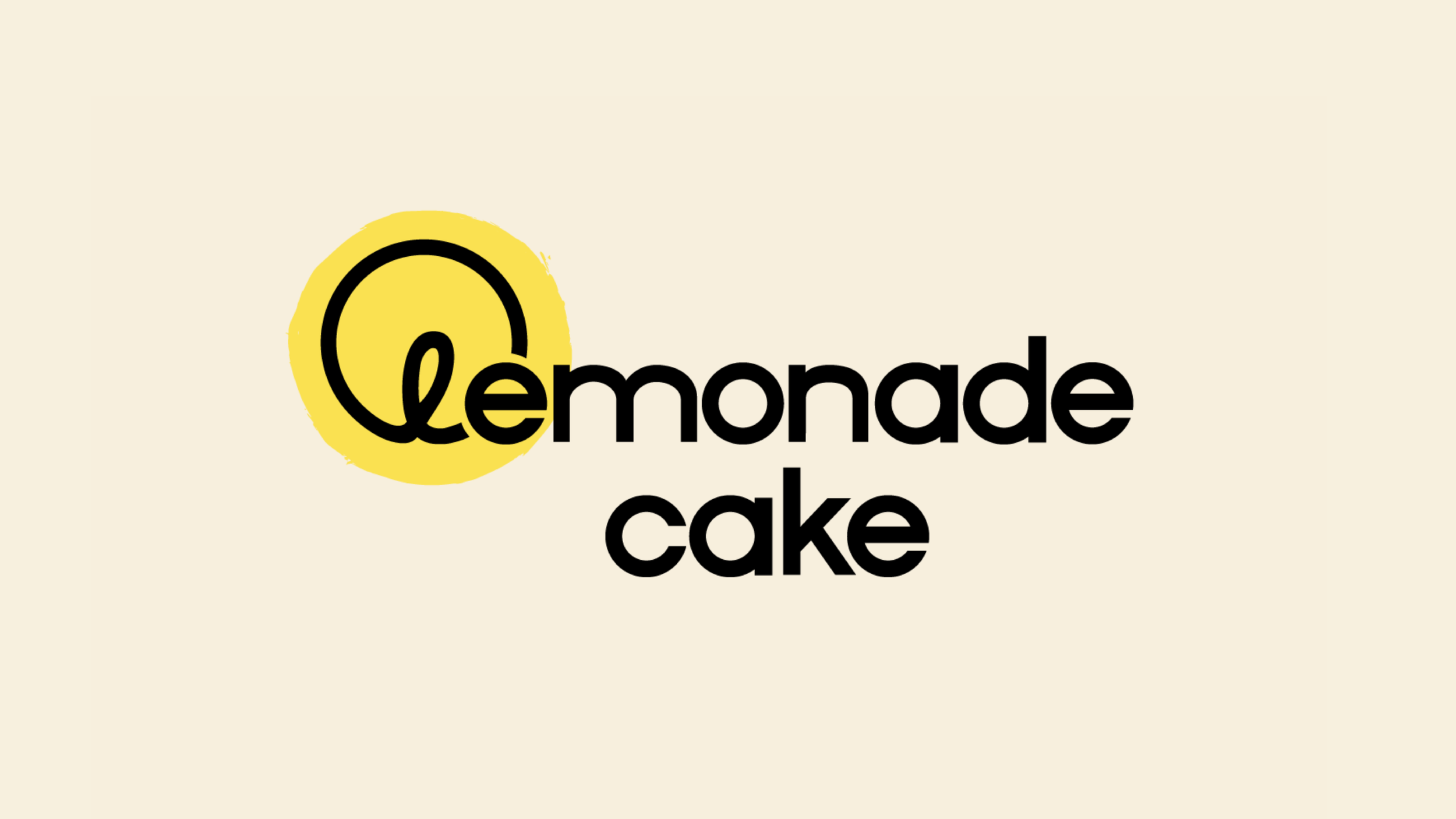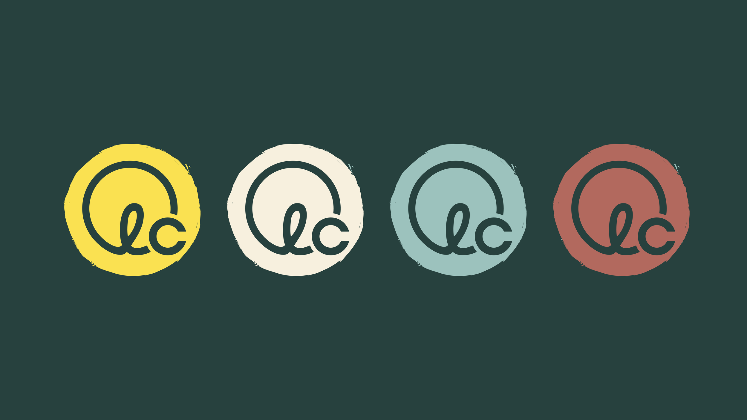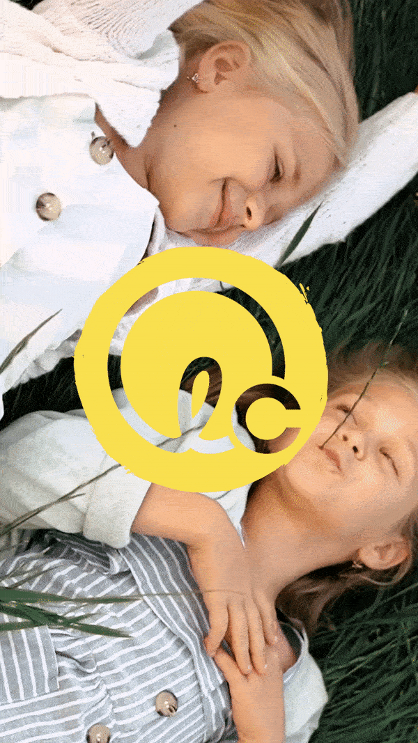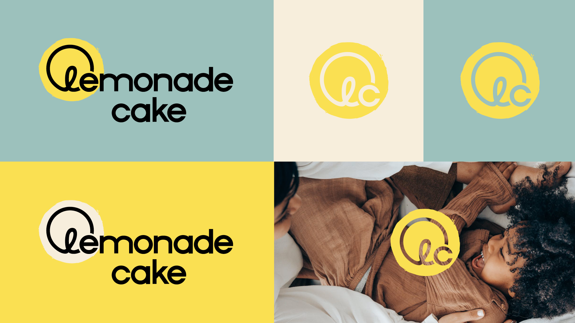

With a sunny and do-good disposition, Lemonade Cake is a sustainable kids’ clothing brand that donates its proceeds to organizations intent on ending child trafficking. Such a glowing entity required a visual identity to match. So we put the sun, a yellow-y symbol of hope and warmth, front and center to shine on the comfort that we provide children. We also intentionally selected a typeface for Lemonade Cake that’s playful, without being childish.
BRAND STRATEGY
BRAND IDENTITY
PACKAGING DESIGN
ART DIRECTION
COLLATERAL DESIGN